


 Edit on GitHub
This course is no longer maintained and may be out-of-date. While it remains available for reference, its content may not reflect the latest updates, best practices, or supported features.
Create the Query UI
We'll need a simple UI that allows users to query information. We're going to create the following two-column layout with a friendly greeting on the left, and the input and configuration options on the right. To make development of this a breeze, we're going to use Tailwind's built-in classes.
Create the two-column layout
First, we'll create a new file called Input.tsx inside /app/components and add the following:
export default function Input() {return (<div className="grid grid-cols-1 lg:grid-cols-5 h-screen p-4"><div className="flex flex-col col-span-2 place-content-center mx-auto text-center md:text-left"><h1 className="text-5xl font-bold mb-4">People Pleasers</h1><p className="text-xl text-slate-500">The most pleasing HR service 😘</p></div><div className="flex flex-col col-span-3 justify-center text-center md:text-left"><h2 className="text-2xl font-bold">How can I help you?</h2><p className="text-sm mb-3 text-slate-500">Ask me anything about the available candidates, their resumes, or the HR managers who are available to helpyou with your hiring process.</p><inputclassName="rounded-lg border w-full p-4 border-gray-300 focus:outline-none focus:ring-2 focus:ring-gray-200 focus:border-transparent"type="text"/><div className="flex mt-4"><input id="toggle" className="hidden" type="checkbox" /><labelclassName={`flex items-center cursor-pointer w-12 h-6 rounded-full p-1 transition-all ease-in-out duration-200 bg-gray-300`}htmlFor="toggle"><div className={`bg-white w-4 h-4 rounded-full shadow-md transform duration-200 ease-in-out`} /></label><span className={`ml-3`}>Talk to me like a human (resource)</span></div><buttonclassName={`bg-indigo-500 text-white rounded-lg px-8 py-4 mt-4 hover:bg-indigo-600 transition-all ease-in-out`}>Ask</button></div></div>);}
Then, we'll import and add this component between the <main> tags in /app/page.tsx:
import Input from "./components/Input";import QueryResponse from "./components/QueryResponse";export default function Home() {return (<main className="p4"><Input /></main>);}
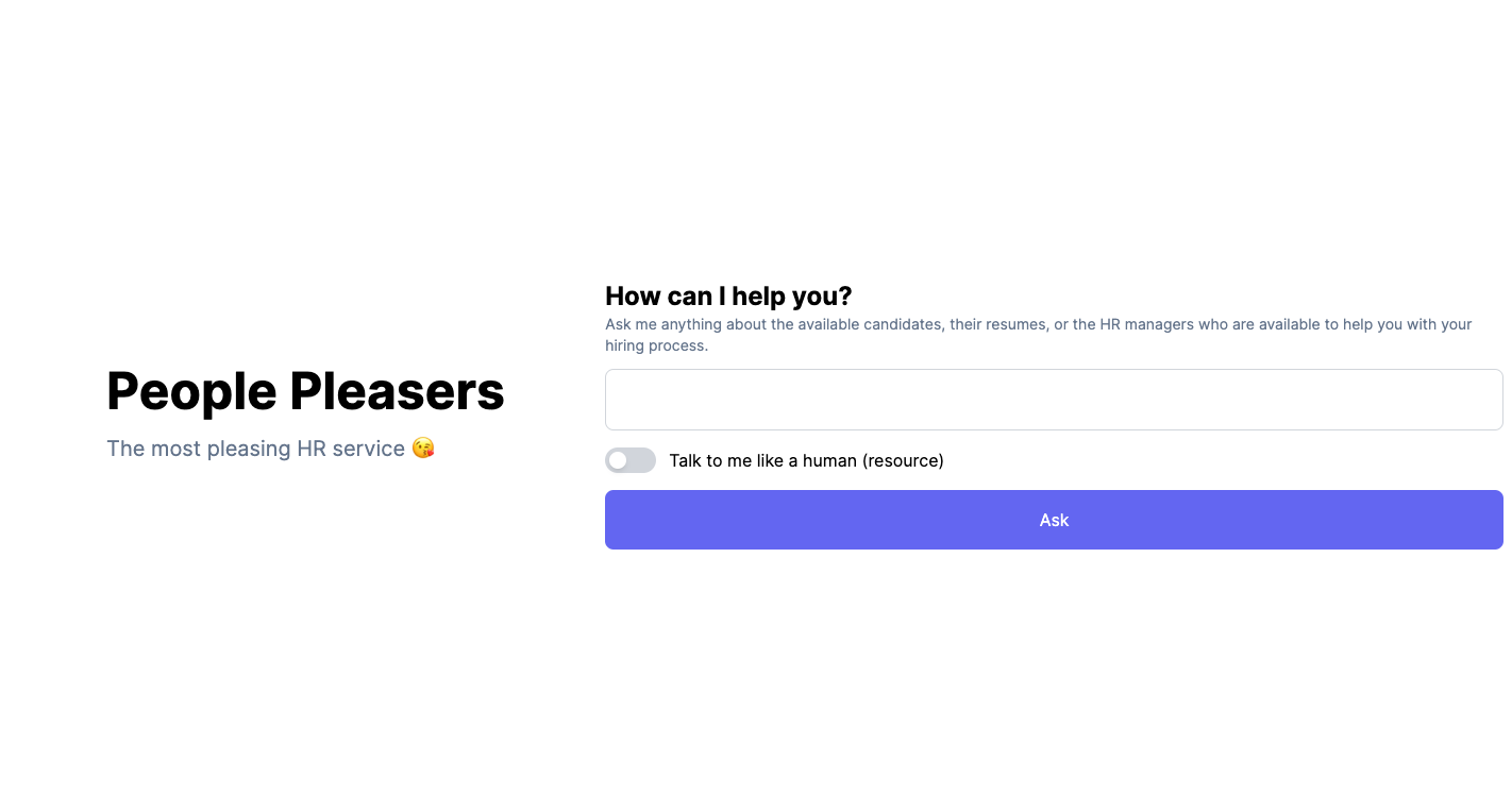
Of course, we're doing a lot here. If you were to refresh your page, you should see most of the UI for the what will be the top-half of our page. Let's break down what we're doing here:
- We're using Tailwind's grid system to create a two-column layout. The first column will be 2/5 of the screen, and the second column will be 3/5 of the screen on large screens.
- Within the different elements, we're using utility classes to style the text, inputs, and buttons. You can learn more about them here and - while they may seem intimidating at first - they're a great way to quickly style your UI without having to write a lot of CSS.
 Build apps and APIs 10x faster
- Built-in authorization and caching
- 8x more performant than hand-rolled APIs